For some individuals with disabilities, information that relies solely on sensory characteristics, such as perceptions of shape, sound, or color are not accessible. Visit the information about color page to learn more about proper use of color.
When you provide content where using shape is appropriate or desired, always make sure that there is another signifier for what the purpose of the shape is.
1.3.3 Sensory Characteristics: Instructions provided for understanding and operating content do not rely solely on sensory characteristics of components such as shape, size, visual location, orientation, or sound. (Level A)
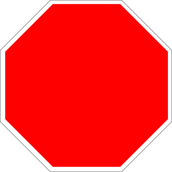
For example, if you were using an image of a stop sign to signify to the reader very important content, you should always make sure the alternative text of that image matches your desired meaning.
It is also good practice to not rely on one sensory characteristic alone to convey meaning. Just like the examples on the Color page, make your content work for the widest possible audience by thinking about who might be viewing your site, and where the barriers might be for someone to gather full meaning.

For example, if you were using an image of a green arrow to signify go to the next page, you should always make sure the alternative text of that image matches your desired meaning. You should label the alt text for the image as "Next" and provide some instructions on the page with the effect of, "To move to the next page, select the green arrow icon labeled Next in the lower right of the page."
In addition to these items, never use instructions that rely on the perception of shape, color or (for the most part) location alone. If you are trying to orient a user to your page, avoid using language similar to the following:
These instructions would rely on someone's sensory characteristics that might not be available. Instead if you still want to use sensory instructions, include other cues for orientation similar to the following:
<strong> emphasizes text to screen reader users as well - usually the voice changes - never use <b> use <strong> insteadAll of the above comments pertain directly to your work in Drupal. You must always make sure the alternative text is coded properly for each image you use.
Understanding Success Criteria 1.3.3 Sensory Characteristics